
We did something this month that we probably should have done ages ago. We sat down, started a fresh game, and tried to play it like someone who’d never seen it before.
It was humbling.
The engineering holds up really well. The stone, the fracture, the tools, the commission system: it all works, and there’s a test suite of a few hundred tests making sure it keeps working. But there wasn’t much game to play. And it looked like a Rembrandt painting. Very atmospheric, very brown, very dark. Nobody would call it cosy.
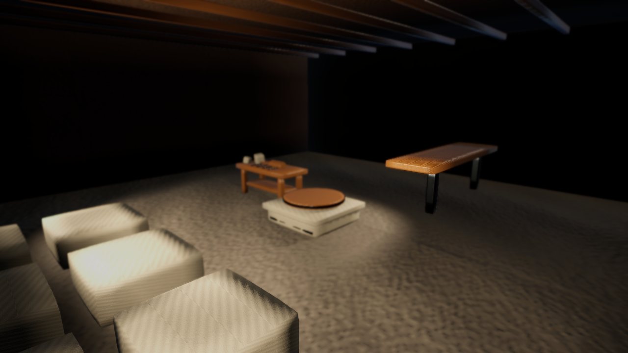
Writing down what “cosy” means
We’d been saying “cosy” since day one without ever pinning it down. So we did. It’s a short list:
- Relaxing, not punishing. Mistakes should be recoverable. The stone can be strict if you ask it to be, but it isn’t by default.
- Satisfying, tactile carving. Every strike should feel and sound good.
- A warm town that grows with you. The world should notice what you’ve done.
And the whole game in one line: take a commission, buy the stone, carve it, deliver it, and watch the town change. Anything that doesn’t help with one of those gets parked. That turned out to be a surprising amount. We’d built some very serious quality-checking machinery, the sort of thing a much bigger studio would use, and it was slowing everything down. It’s still there. We just don’t let it stop us anymore.
Turning the lights on
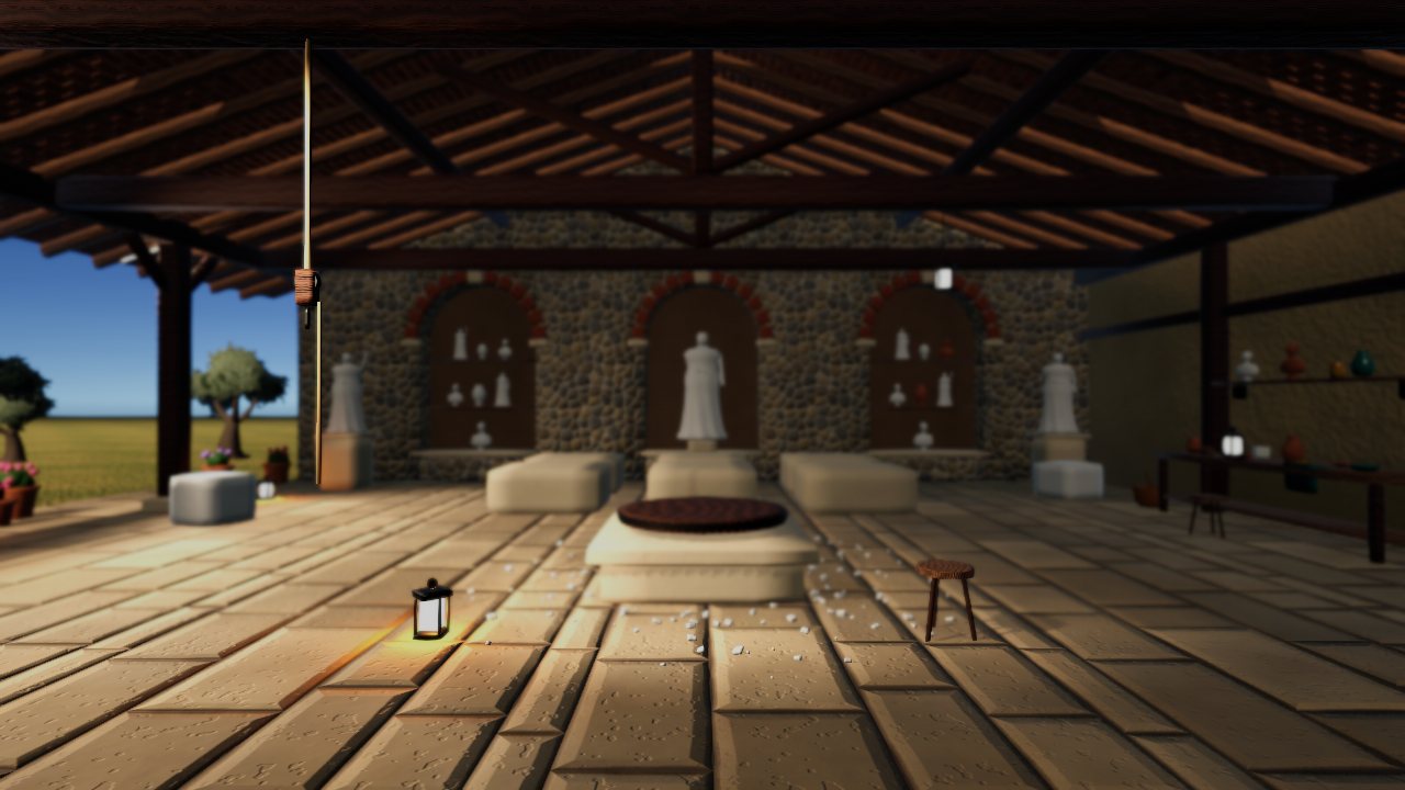
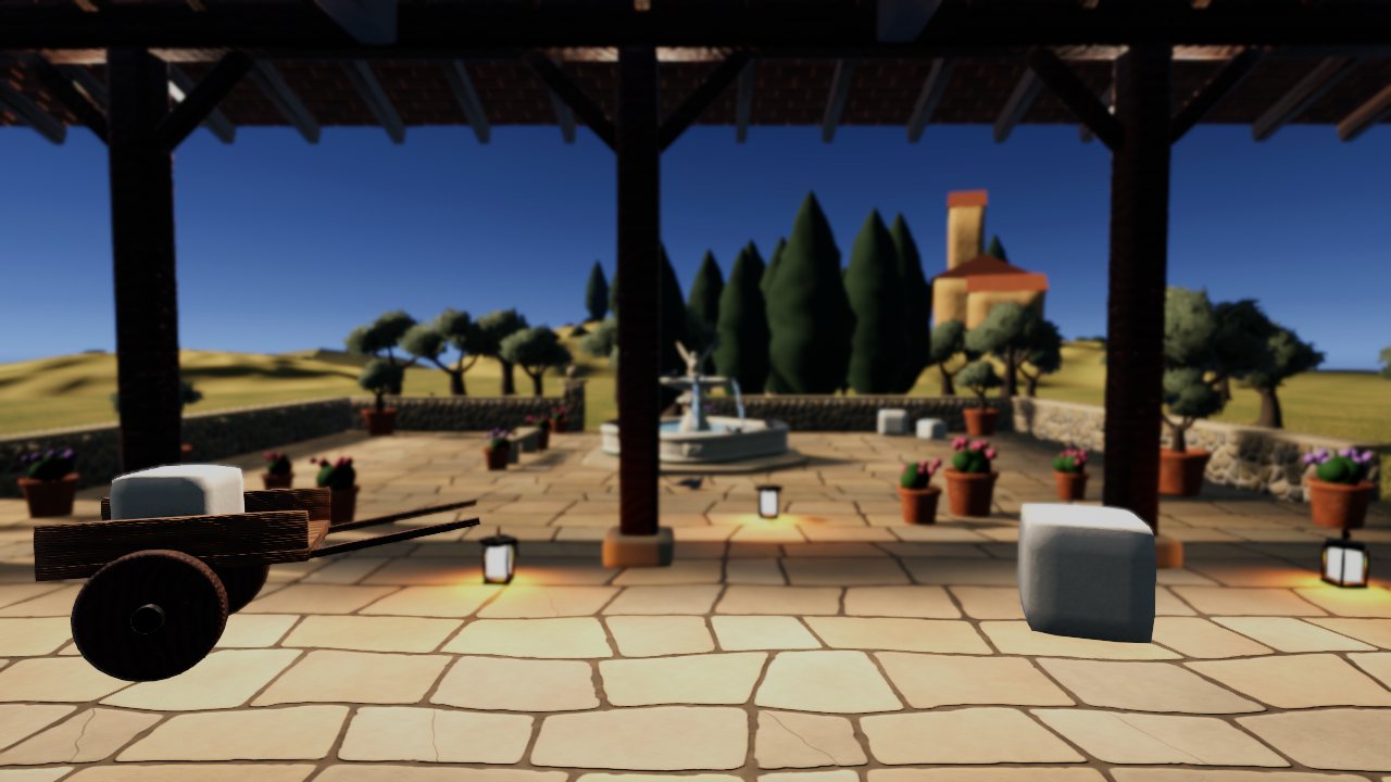
The first job was the obvious one. A warmer, brighter look, softer shadows and a gentle glow instead of pools of black. The sandy floor got replaced with proper flagstones. The wood stopped looking like corrugated cardboard. And the windows now look out on a courtyard and some countryside instead of a flat grey plane and the default sky.
Two kinds of menu
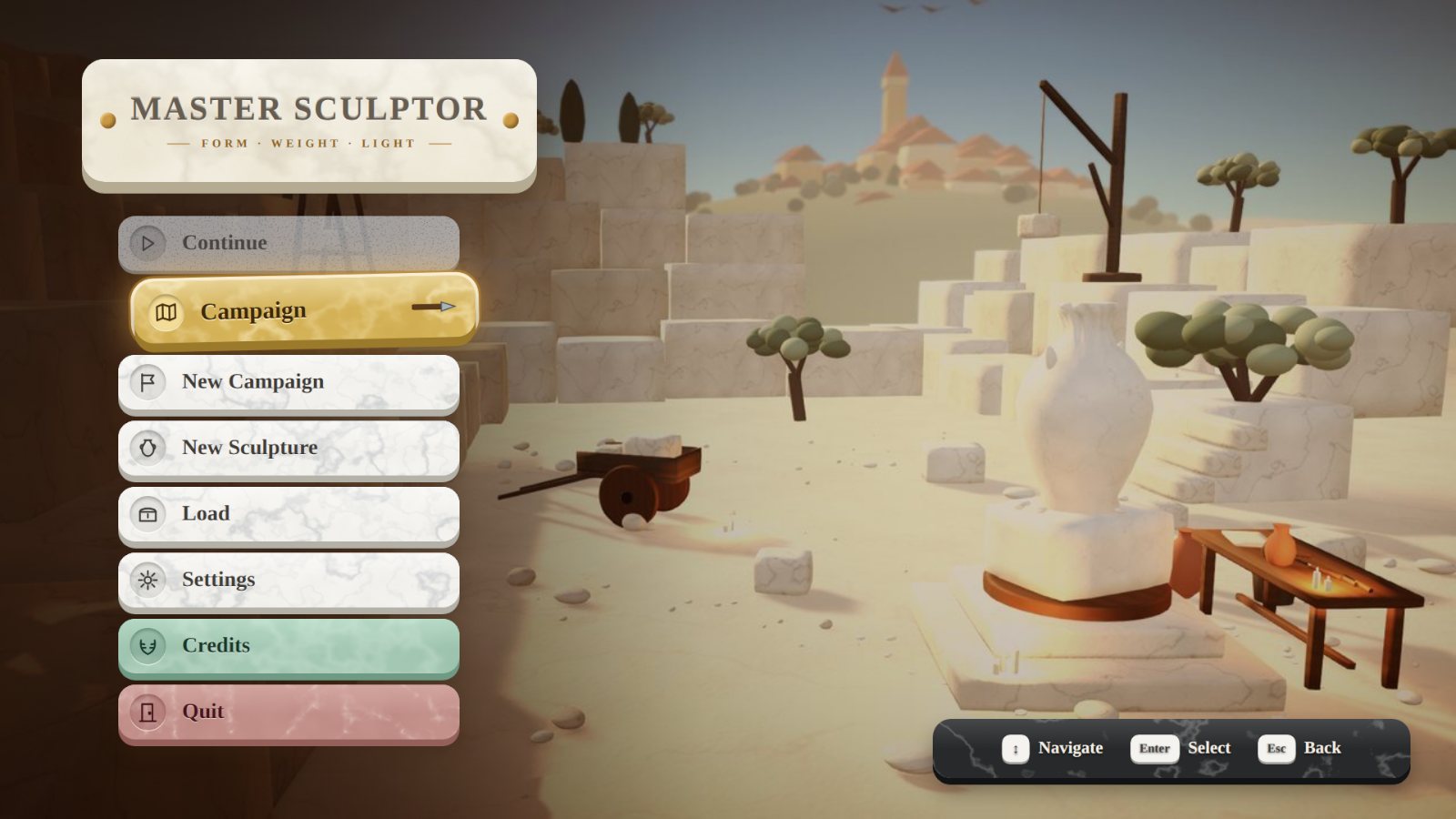
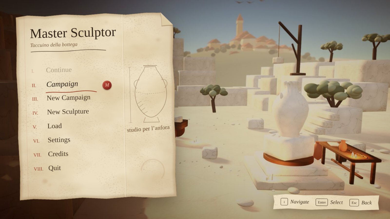
The UI got the same treatment. It’s now split into two styles with a simple rule: if Matteo would plausibly write it down, it’s a page from his sketchbook; if it’s the game talking to you, it’s carved stone.
The stone style (internally “Atelier”) is used for the title screen, settings and save menus. The buttons are rounded marble tiles cut from the same stones you carve, and the one you’ve selected lifts and turns golden. The sketchbook style is for everything in the world: commissions, the map, the stone yard, your ledger. Aged paper, sepia ink, Roman numerals and a red wax seal on whatever you’ve picked.
Sound
This might be the change that matters most, and it’s the one you can’t see. A cosy game is half audio. So we’ve drawn up a list of every sound the game needs, and a big chunk of it, around 180 sounds, we’re recording ourselves. Real chisels on real stone. Light, medium and heavy takes for each chisel so that no two strikes sound exactly the same, footsteps on every kind of floor, the ring of the wedges when you split a block. There are worse ways to spend a weekend than hitting rocks with a microphone pointed at them.
Music is going the same way: gentle lute and guitar, nothing that fights with the sound of the chisel.
It’s a funny feeling, spending months on something and then deciding a lot of it was pointed slightly in the wrong direction. But it’s the right call, and the game already feels more like the one we meant to make.
Cheers,
Alistair